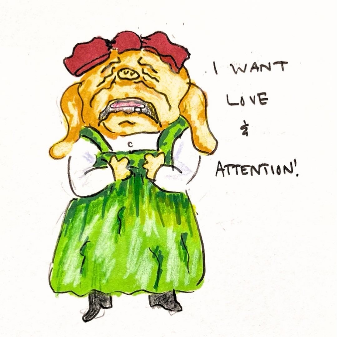
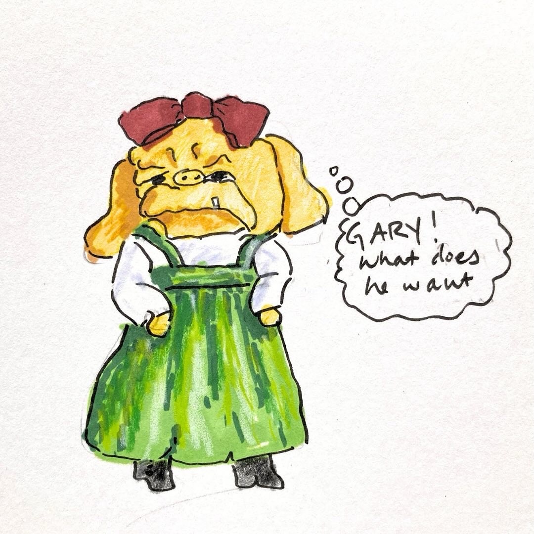
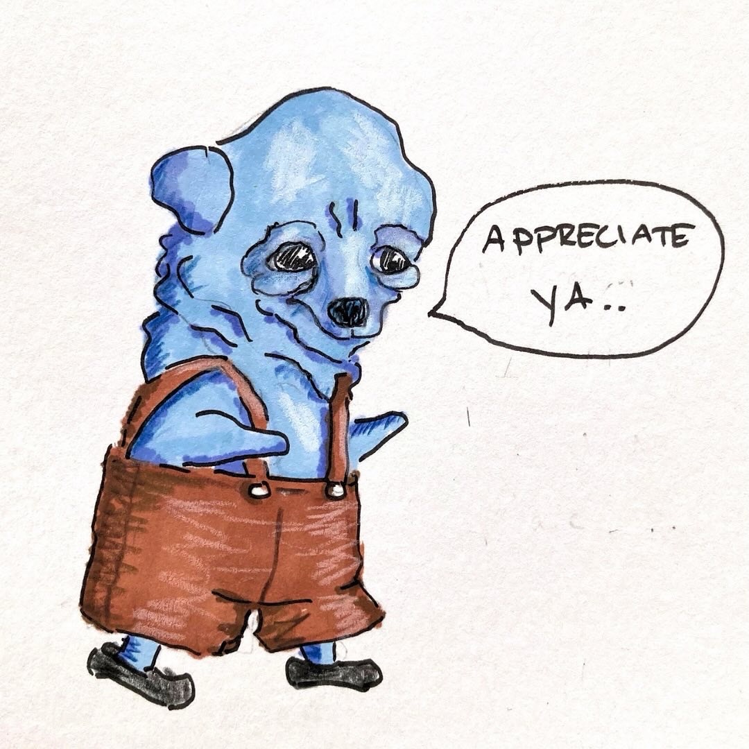
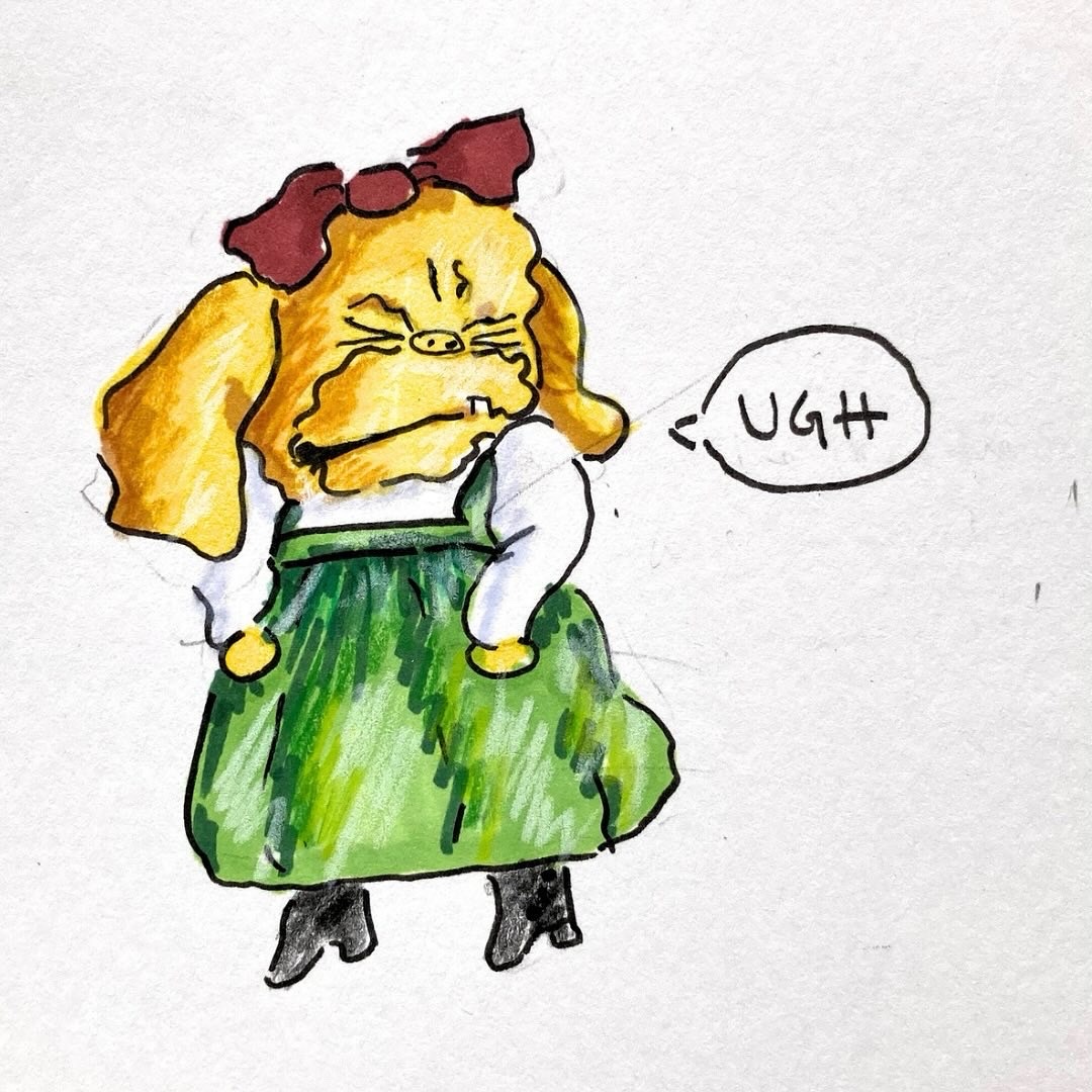
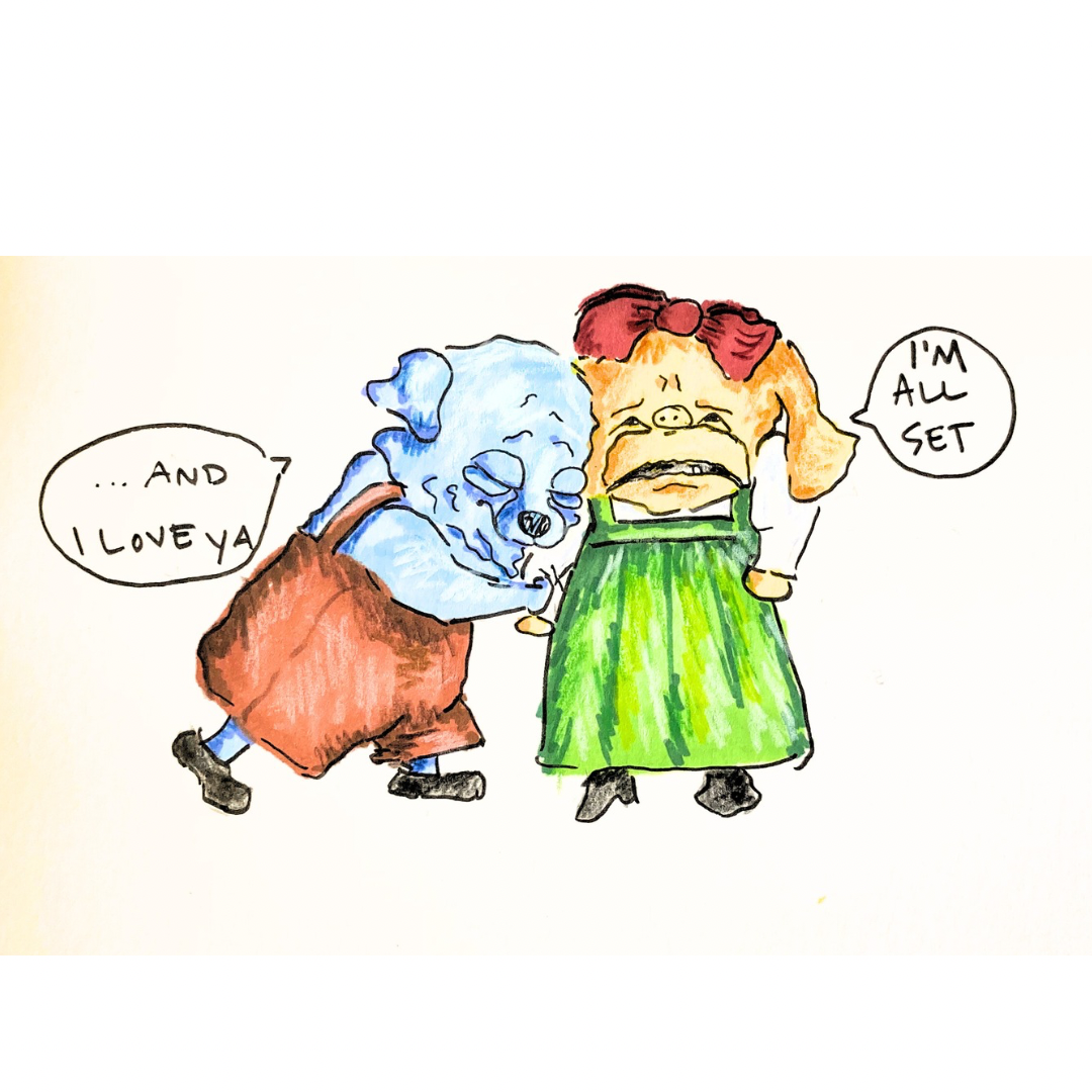
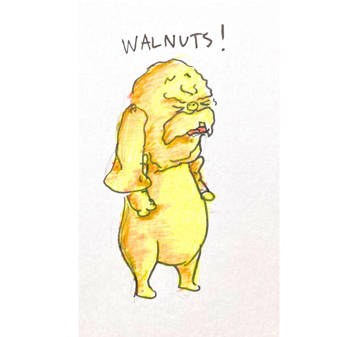
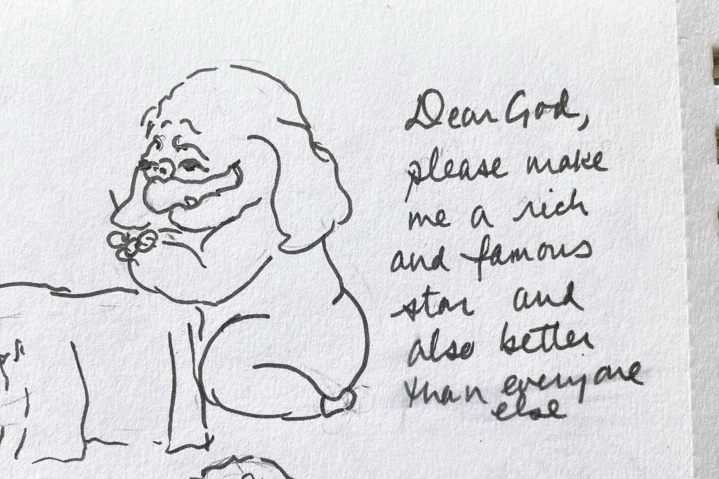
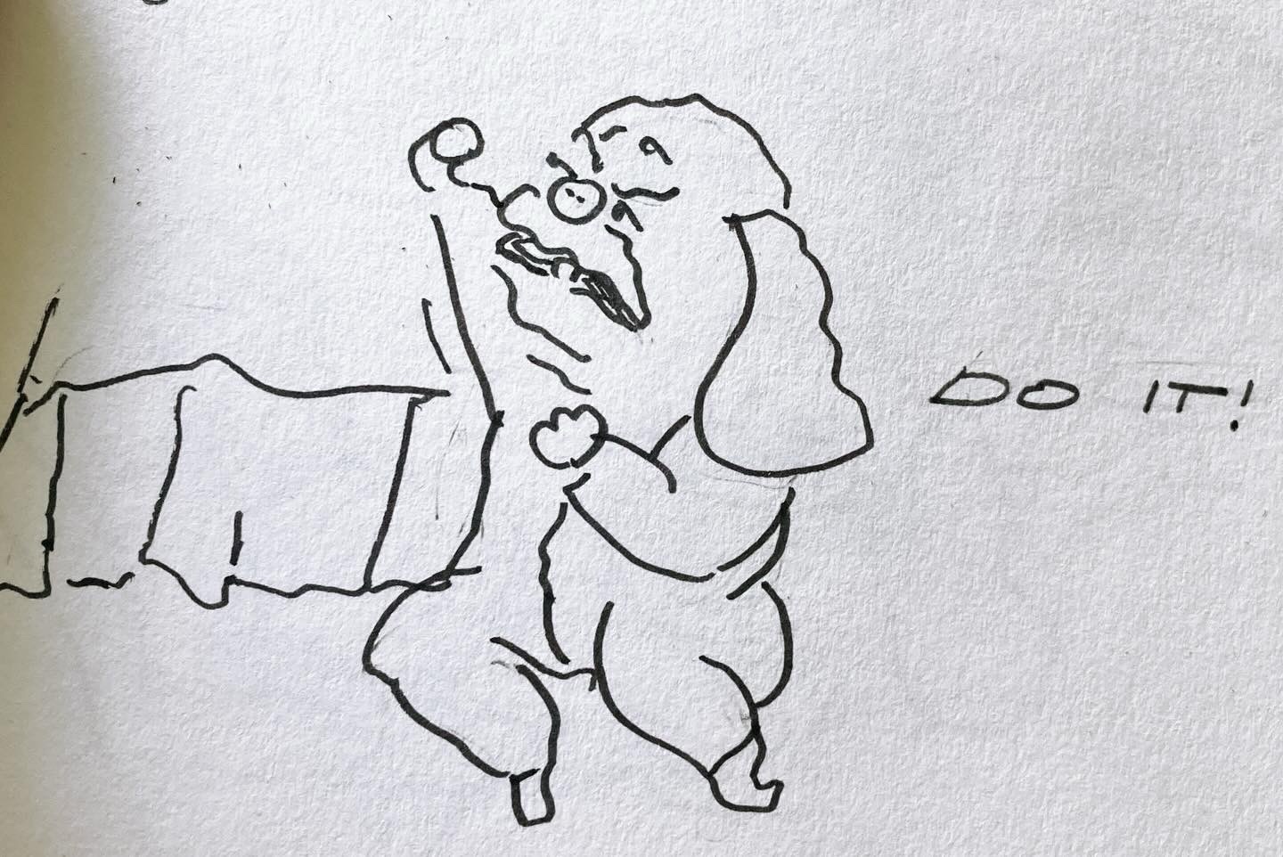
Earlier this spring I was playing around in my sketchbook when a new character began to emerge. Curmudgeonly and irritable yet hopelessly persistent in her efforts to be famous/loved as well as to live as a Little House on the Prairie cosplayer, I named her Geraldine. It has been really fun to do more of a cartoon style.
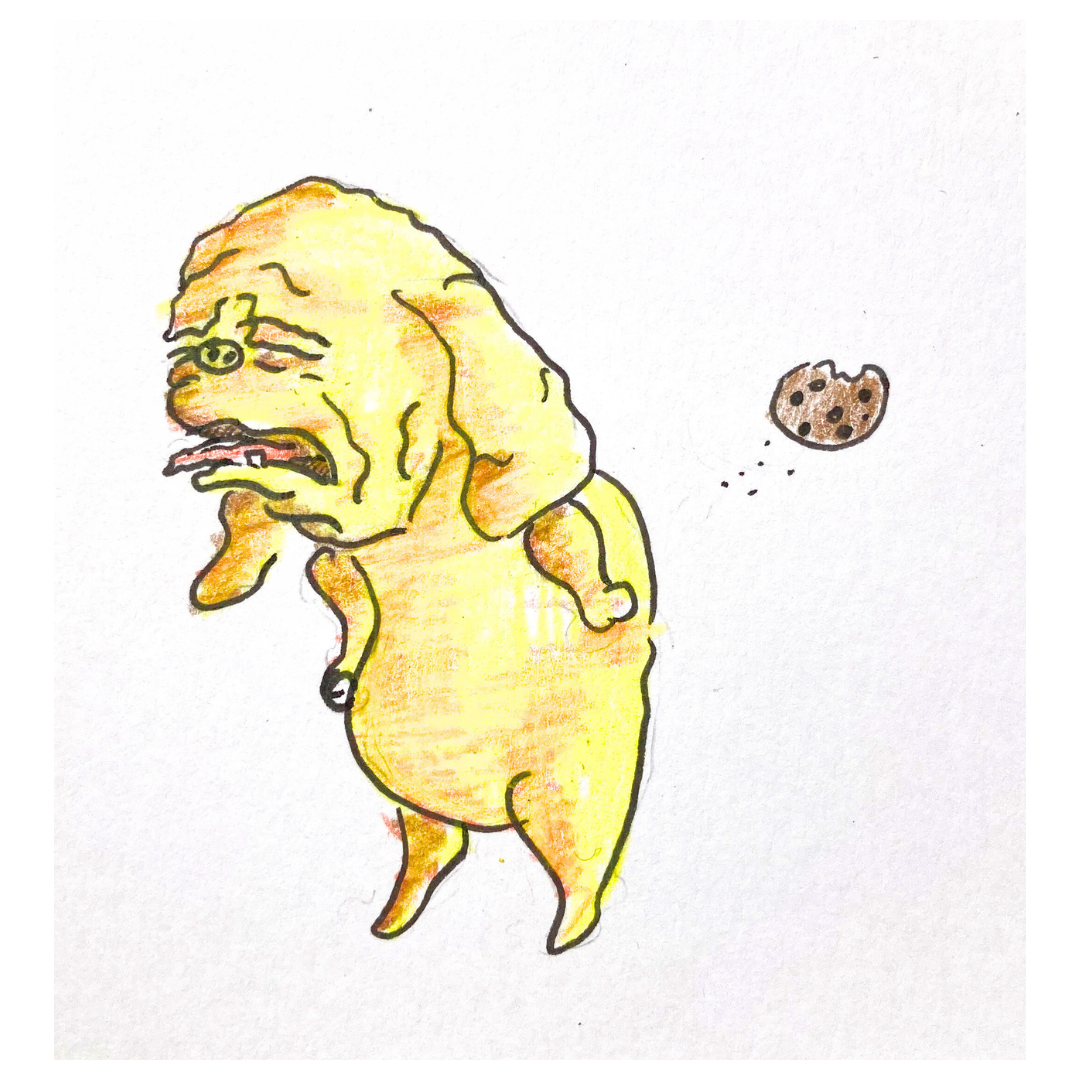
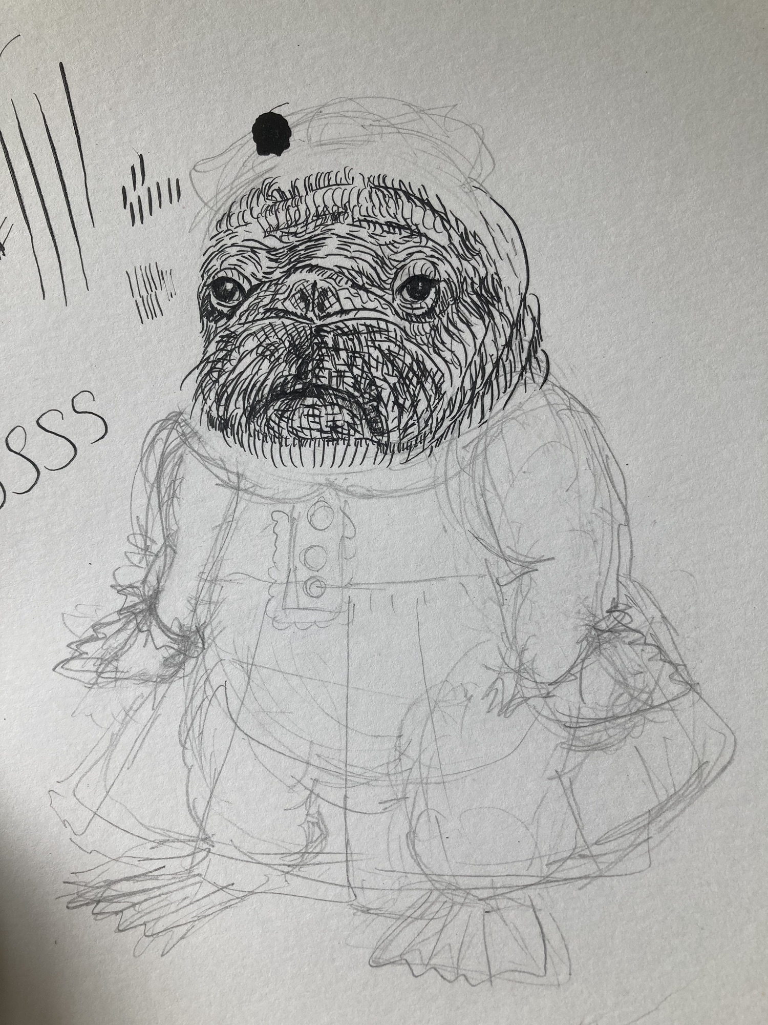
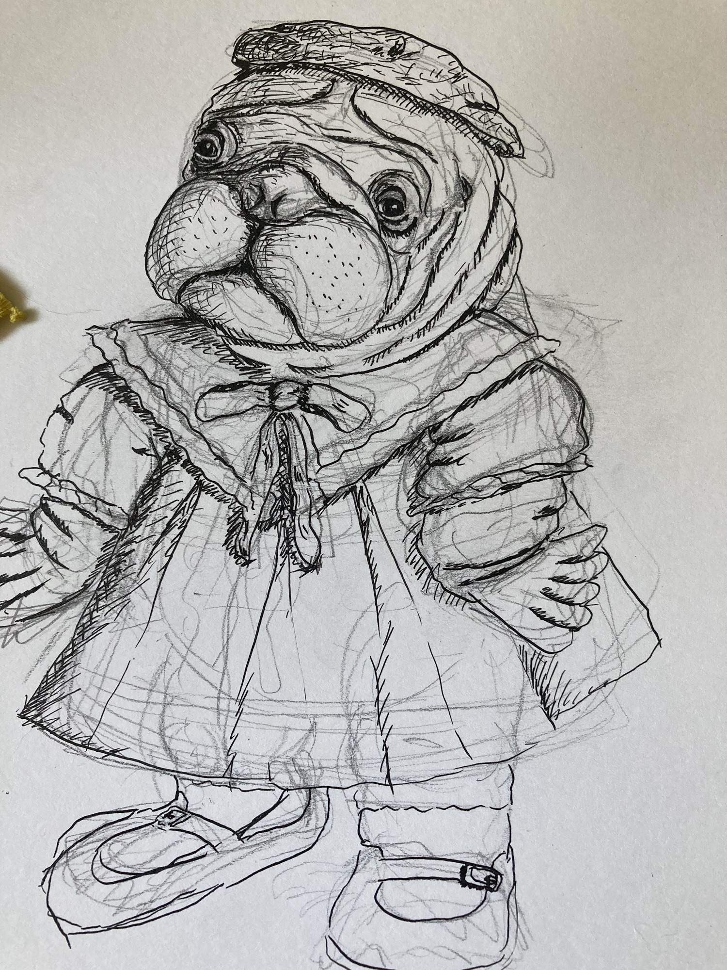
My love of baby walruses started last fall and they had been showing up a lot in my sketchbook. I have been practicing my pen and ink skills, particularly shading via hatching.
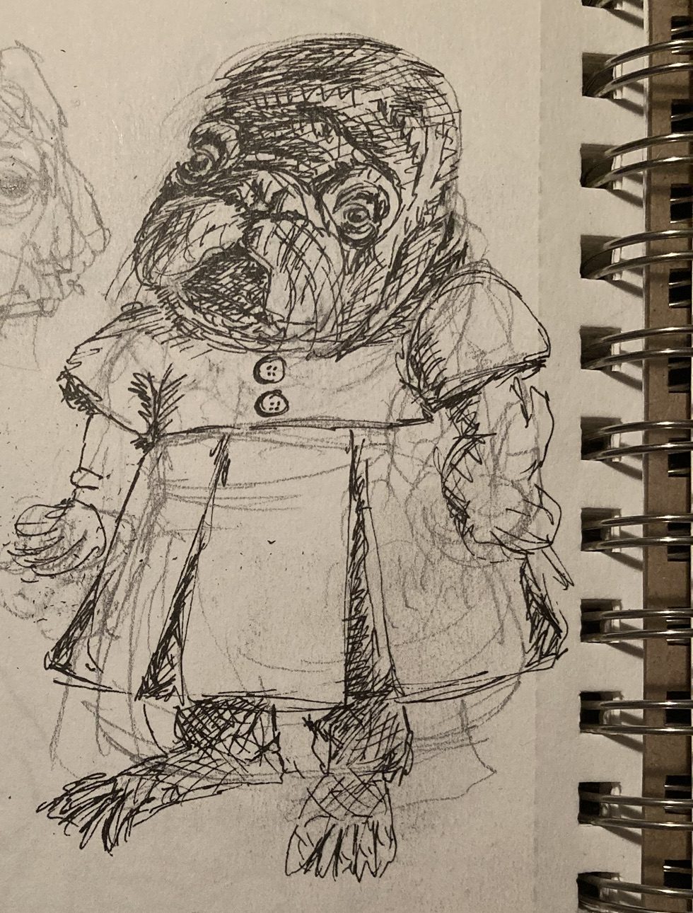
After my initial sketch, I decided to make a more official try but I got off on the wrong foot with my inking; it started to look furry and it was an example of where less would have been more! I’ve realized that trying to use the hatching to show local color is rarely going to be the right choice for me, especially since most of my illustrations are on the small side.
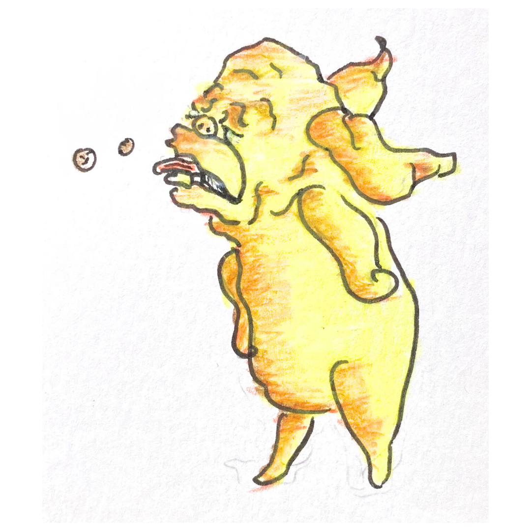
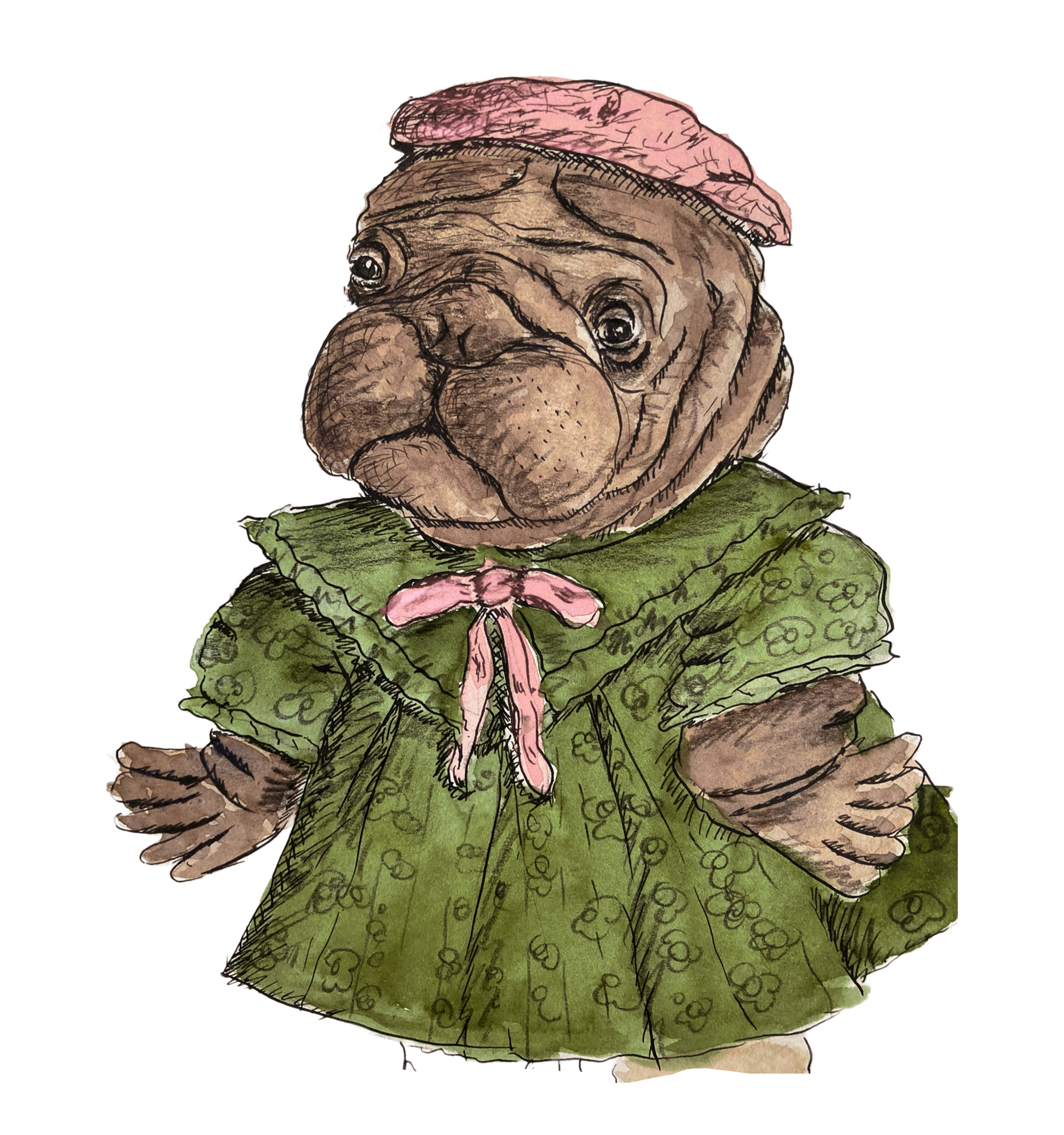
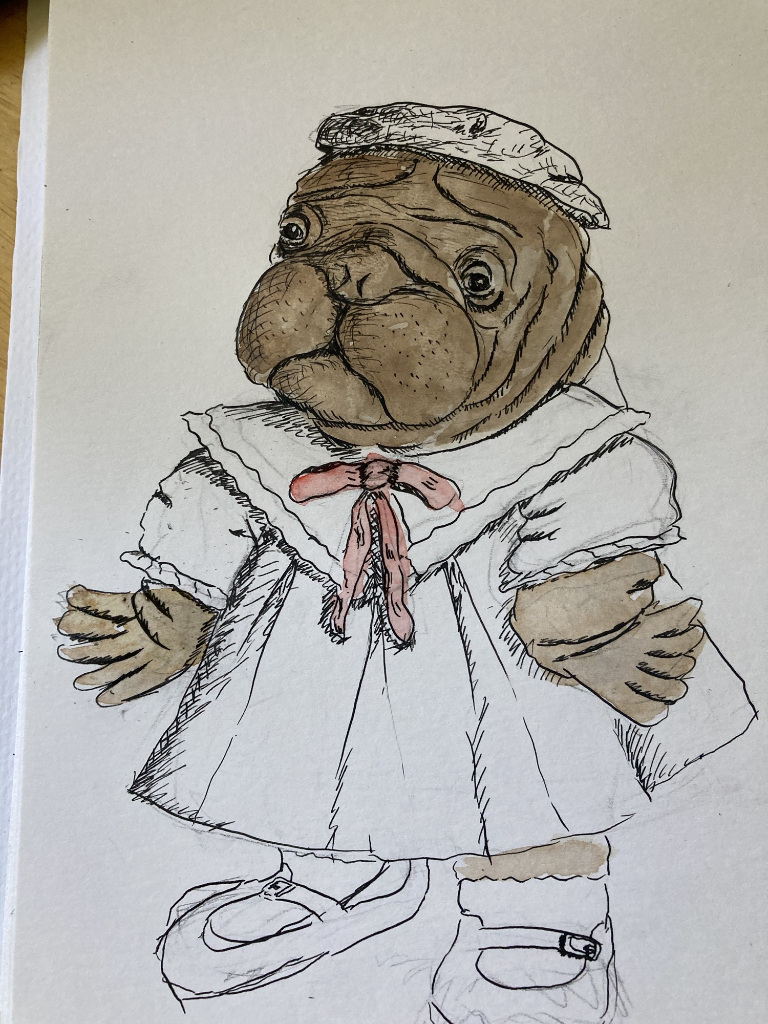
Below you can see my third attempt of this walrus girl (as you can see, I botched the left foot and eventually simply removed it!) I had decided that I would try to render this illustration using the same style/process that Arnold Lobel commonly used for books like Uncle Elephant or Owl at Home. After studying these books and listening to an interview of his, it sounded like he would do an initial pen drawing and then color with watercolor, and also add graphite pencil. I thought it was really interesting that the two color separation printing process often limited artists to selecting two colors (in addition to black) from a range of swatches. Artists would have to provide separate plates/layers for each color and they would have to guess as to how the two colors would interact on the parts where they overlapped. An interview I heard on a podcast provided some insight to this process; apparently, once you had one experience with the colors you selected, at least you had that information for next time and there would be less guesswork involved.
Anyway, I thought it would be fun to try to limit myself to two colors and also to use the graphite shading idea. For some reason it had never occurred to me to use the graphite pencil over the color rather than erasing all of my pencil lines. I often feel very affectionate toward my pencil sketches and miss them once erased after inking. Adding more pencil lines helped reclaim some of that warmth that I would often be missing from my initial sketch.
As you can see, I didn’t quite manage to stick to two colors and I also ended up with a very similar color scheme to Lobel’s Uncle Elephant! Although I messed up the feet, I do love how this illustration turned out. While I have work to do as far as my pen skills, I think the combination of the pen work, the watercolor and that touch of graphite shading creates an overall luminous illustration with pleasing light and shadow.
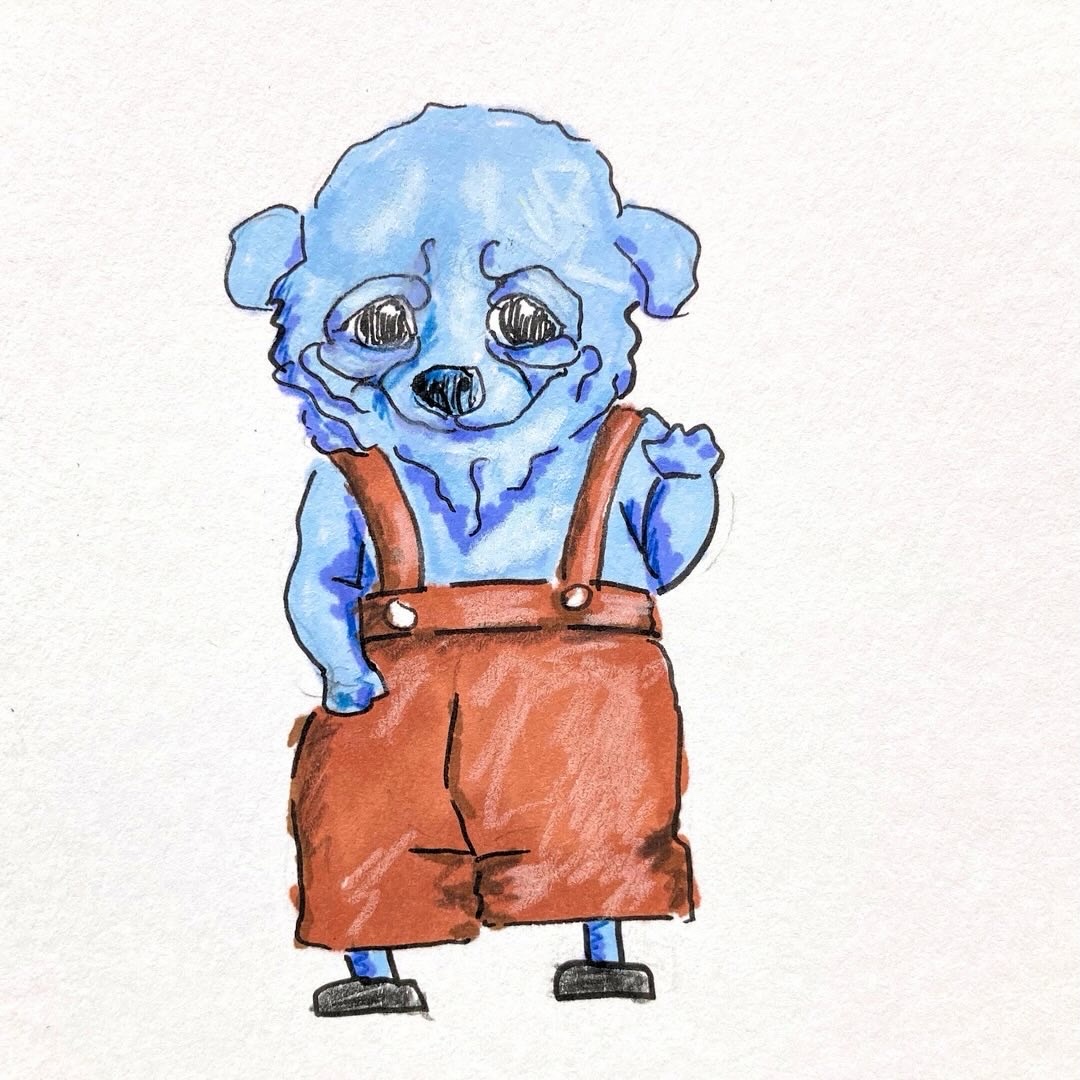
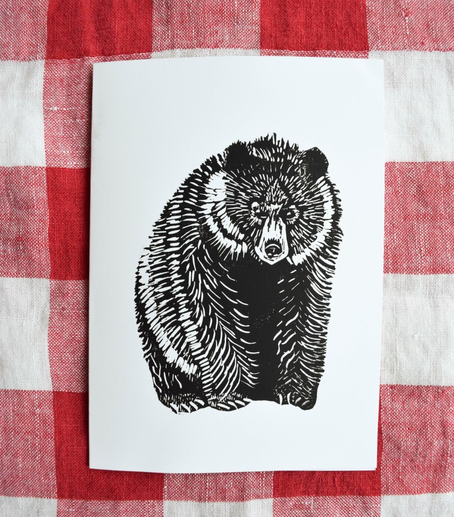
I periodically get to thinking about bears a lot. My husband and I actually saw one bounding across the road recently and I have a novel I’ve been working on for ten years that features bears as well.
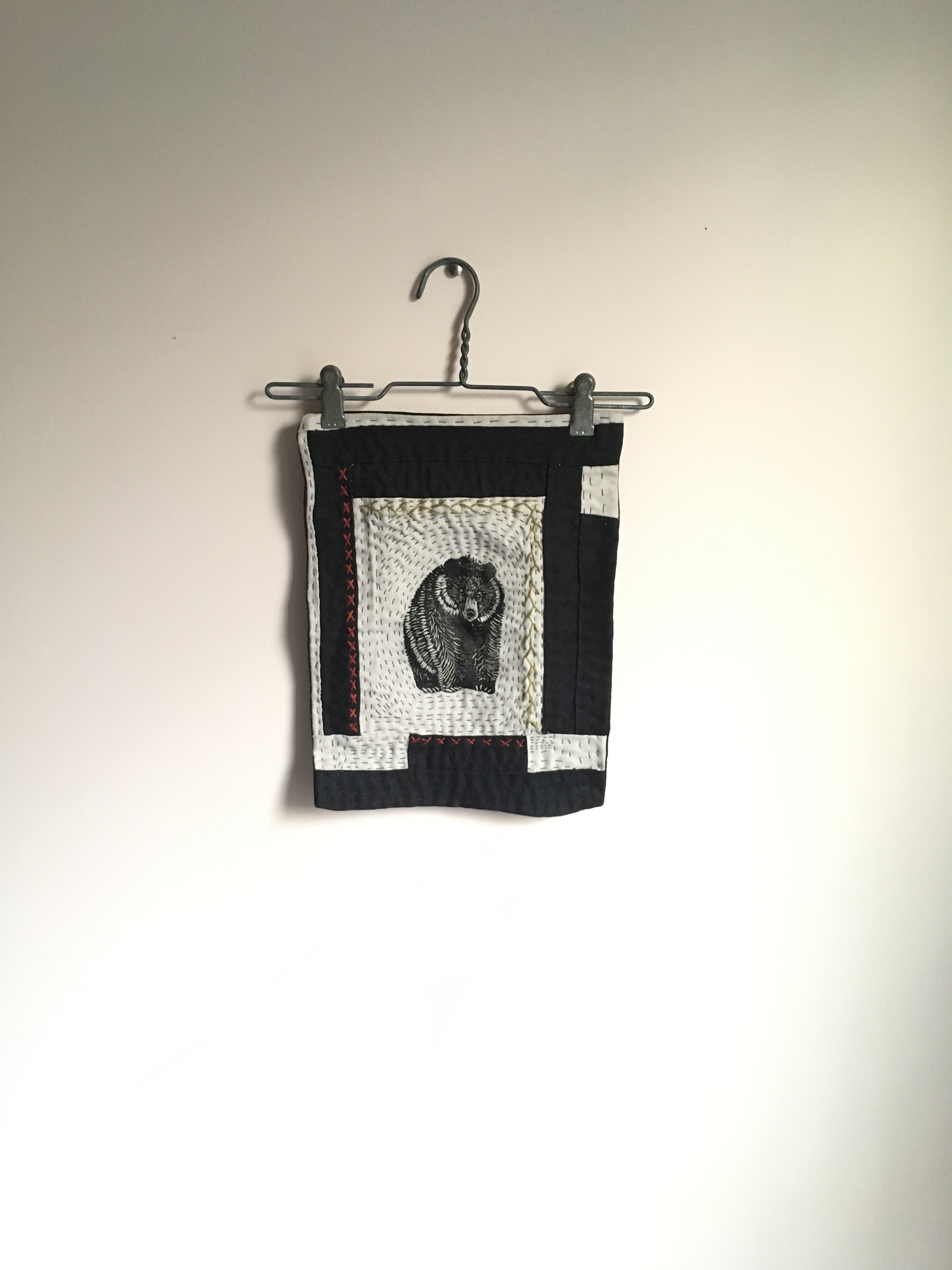
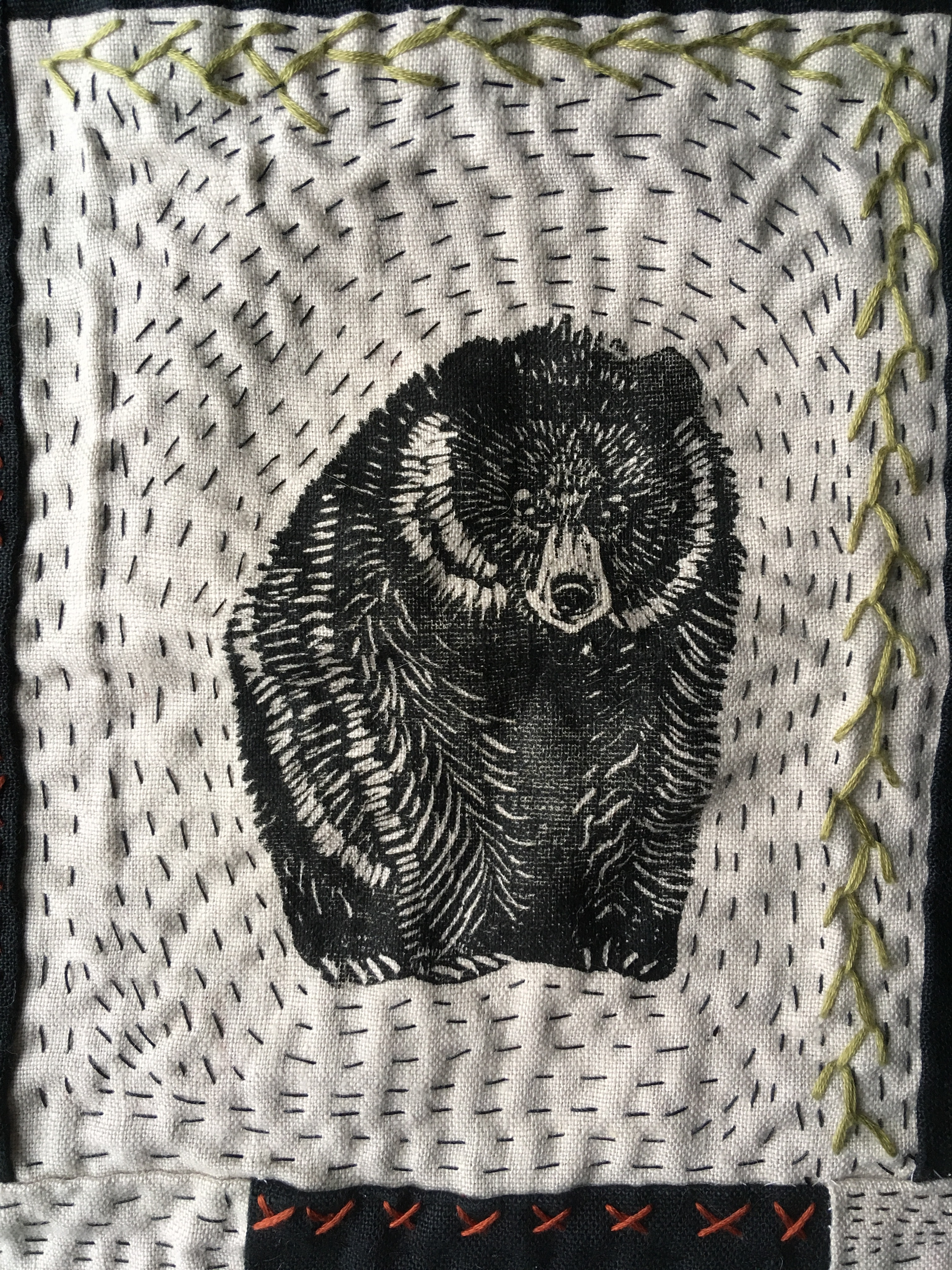
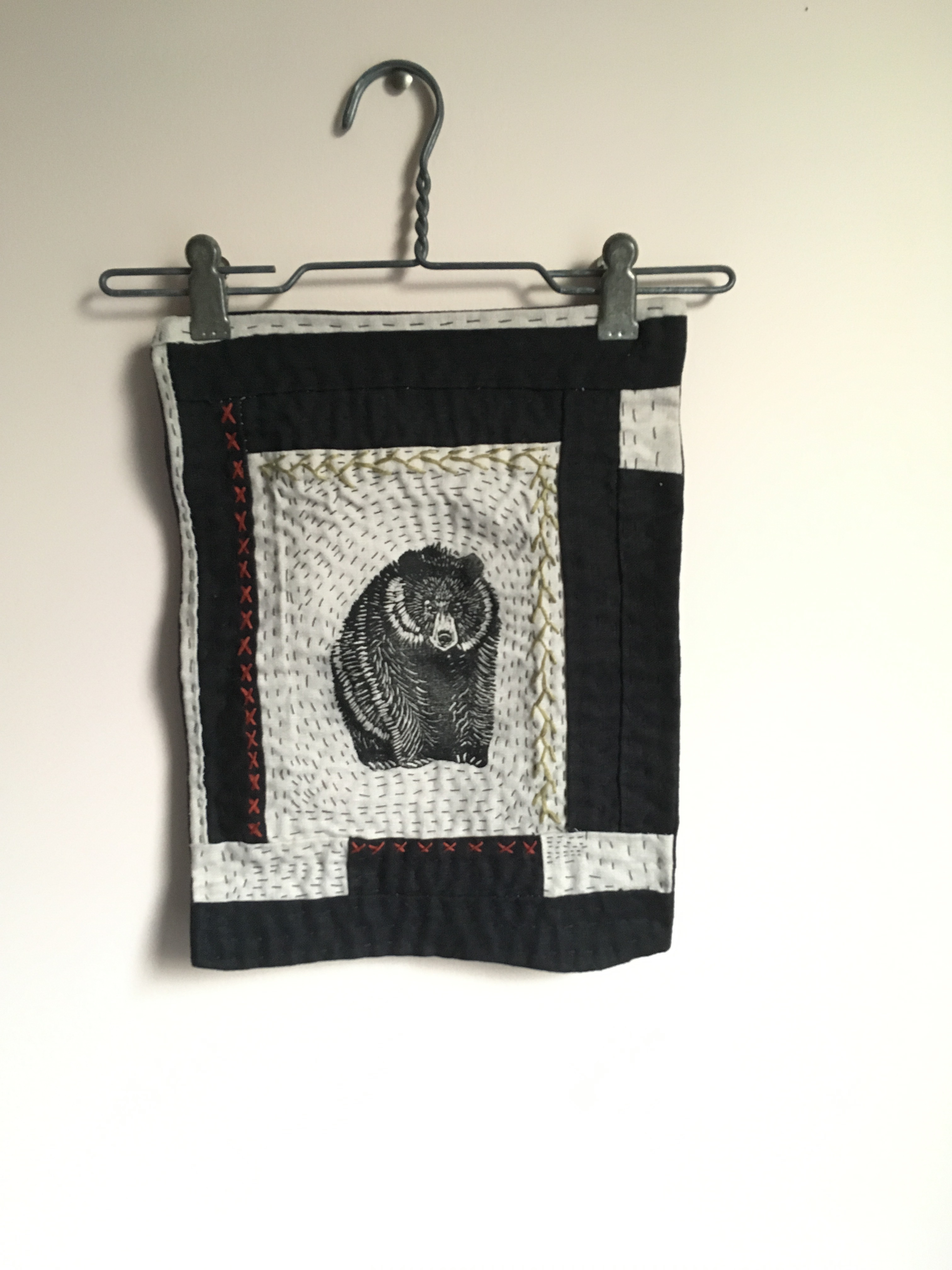
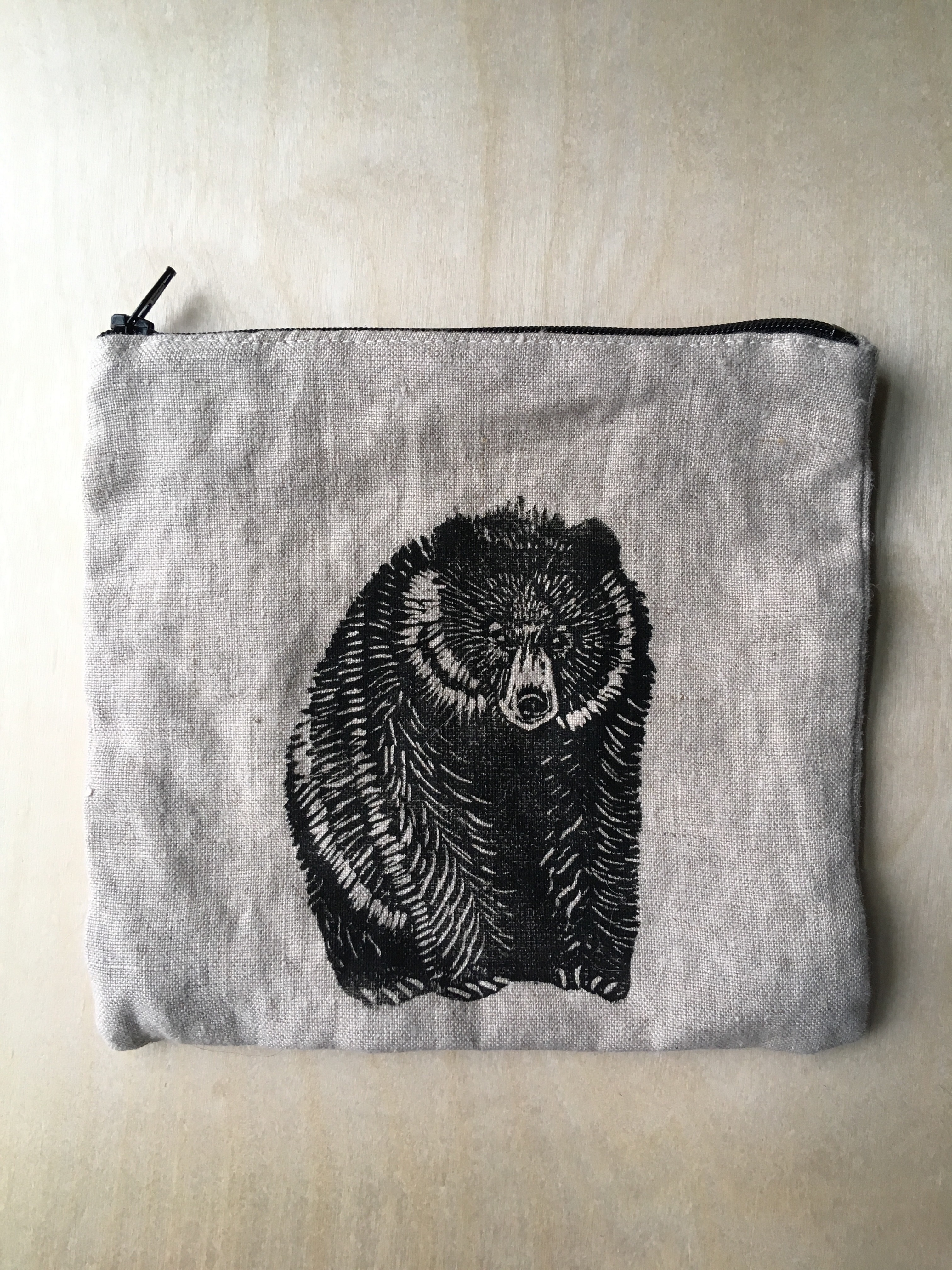
After my daughter was born I did a lot of hand-carved linocuts and block prints. This particular bear was one of my favorites and I printed it many times on many different surfaces.
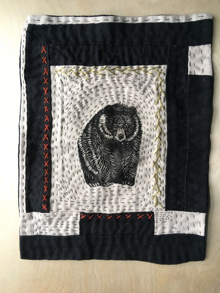
This quilt flag features the bear printed on linen and surrounded by embroidery and sashiko style hand quilting. I haven’t been doing much carving, printing or quilting lately but I keep thinking I’ll get back to it.
This quilt flag is available to purchase right here:
Bear Quilt Flag
$72.00
And so are two handsewn, lined linen zipper pouches with the same print!